silverwind
649aada366
Remove fomantic list module ( #30281 )
...
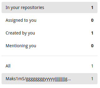
Likely still some unnecessary CSS but any combinations with the `ui
list` classes are covered. There was only on instance of `horizontal
list` which I removed. It was this part of the commit page:
<img width="396" alt="image"
src="https://github.com/go-gitea/gitea/assets/115237/c49ec4f5-93c3-41d6-a907-cdbedf8abc44 ">
2024-04-06 21:33:45 +00:00
wxiaoguang
ca5c895efb
Render embedded code preview by permlink in markdown ( #30234 )
...
The permlink in markdown will be rendered as a code preview block, like GitHub

Co-authored-by: silverwind <me@silverwind.io>
2024-04-02 17:48:27 +00:00
silverwind
ff334749f5
Remove fomantic input module ( #30194 )
...
Another pure CSS module. Some styling is part of the `form` module which
will likely follow next.
2024-03-31 16:06:06 +00:00
silverwind
8fd15990c5
Remove fomantic checkbox module ( #30162 )
...
CSS is pretty slim already and the `.ui.toggle.checkbox` sliders on
admin page also still work. The only necessary JS is the one that links
`input` and `label` so that it can be toggled via label. All checkboxes
except the markdown ones render at `--checkbox-size: 16px` now.
<img width="174" alt="Screenshot 2024-03-28 at 22 15 10"
src="https://github.com/go-gitea/gitea/assets/115237/3455c1bb-166b-47e4-9847-2d20dd1f04db ">
<img width="499" alt="Screenshot 2024-03-28 at 21 00 07"
src="https://github.com/go-gitea/gitea/assets/115237/412be2b3-d5a0-478a-b17b-43e6bc12e8ce ">
<img width="83" alt="Screenshot 2024-03-28 at 22 14 34"
src="https://github.com/go-gitea/gitea/assets/115237/d8c89838-a420-4723-8c49-89405bb39474 ">
---------
Co-authored-by: delvh <dev.lh@web.de>
2024-03-29 04:56:01 +00:00
silverwind
dd8dde2be8
replace jquery-minicolors with coloris ( #30055 )
...
Get rid of one more jQuery dependant and have a nicer color picker as
well.
Now there is only a single global color picker init because that is all
that's necessary because the elements are present on the page when the
init code runs. The init is slightly weird because the module only takes
a selector instead of DOM elements directly.
The label modals now also perform form validation because previously it
was possible to trigger a 500 error `Color cannot be empty.` by clearing
out the color value on labels.
<img width="867" alt="Screenshot 2024-03-25 at 00 21 05"
src="https://github.com/go-gitea/gitea/assets/115237/71215c39-abb1-4881-b5c1-9954b4a89adb ">
<img width="860" alt="Screenshot 2024-03-25 at 00 20 48"
src="https://github.com/go-gitea/gitea/assets/115237/a12cb68f-c38b-4433-ba05-53bbb4b1023e ">
2024-03-29 04:00:07 +01:00
silverwind
e40fc75bac
Render code tags in commit messages ( #30146 )
...
Extend https://github.com/go-gitea/gitea/pull/21432 to commit messages.
Color is changed because the markup code block bg does not offer enough
contrast on varying backgrounds.
<img width="568" alt="Screenshot 2024-03-27 at 19 52 55"
src="https://github.com/go-gitea/gitea/assets/115237/ddc9307e-f32f-4e97-8b88-91f88ced2a36 ">
<img width="573" alt="Screenshot 2024-03-27 at 19 53 33"
src="https://github.com/go-gitea/gitea/assets/115237/14b30fd2-bf28-46b8-9e82-eb60a28f6bf2 ">
<img width="422" alt="Screenshot 2024-03-27 at 19 53 01"
src="https://github.com/go-gitea/gitea/assets/115237/a12136b5-c02b-460c-9830-f830542987ae ">
<img width="397" alt="Screenshot 2024-03-27 at 19 53 27"
src="https://github.com/go-gitea/gitea/assets/115237/c9f05d81-c73e-468e-98e9-e5929bc0da3e ">
<img width="333" alt="Screenshot 2024-03-27 at 19 53 07"
src="https://github.com/go-gitea/gitea/assets/115237/06b5a9f9-f95d-46b6-8c57-df0b02555652 ">
<img width="279" alt="Screenshot 2024-03-27 at 19 53 21"
src="https://github.com/go-gitea/gitea/assets/115237/b06a0afc-ddd8-48ae-b557-a6dc47802e68 ">
2024-03-28 10:42:31 +00:00
silverwind
226a82a939
Migrate font-family to tailwind ( #30118 )
...
Enable us to use tailwind's
[`font-family`](https://tailwindcss.com/docs/font-family ) classes as
well as remove `gt-mono` in favor of `tw-font-mono`. I also merged the
"compensation" to one selector, previously this was two different values
0.9em and 0.95em. I did not declare a `serif` font because I don't think
there will ever be a use case for those. Command ran:
```sh
perl -p -i -e 's#gt-mono#tw-font-mono#g' web_src/js/**/* templates/**/*
2024-03-28 08:31:07 +00:00
silverwind
643e6b0958
Remove fomantic label module ( #30081 )
...
Of note is the CSS has references to "floating label" and "transparent
label" but I could not find those anywhere in the code. They are related
to https://github.com/go-gitea/gitea/pull/3939 , but I think these have
long been removed.
---------
Co-authored-by: delvh <dev.lh@web.de>
Co-authored-by: Giteabot <teabot@gitea.io>
2024-03-27 09:58:02 +00:00
silverwind
f73d891fc4
Remove fomantic table module ( #30047 )
...
Big CSS module. I tested basic functionality on admin and commits table.

---------

Co-authored-by: Giteabot <teabot@gitea.io>
2024-03-25 16:40:50 +01:00
silverwind
8d93cea296
Remove fomantic segment module ( #30042 )
...
Another CSS-only module. Also, I re-ordered the imports based on
[original fomantic
order](https://github.com/fomantic/Fomantic-UI/blob/2.8.7/src/semantic.less ).
2024-03-24 16:48:06 +00:00
silverwind
2d281704de
Remove fomantic container module ( #30036 )
...
Small CSS module. There was a ordering conflict between `.ui.menu` and
`.ui.container` which I've solved by adding the `.ui.menu` rule into
base.

---------

Co-authored-by: Giteabot <teabot@gitea.io>
2024-03-24 14:04:18 +00:00
silverwind
f22fe4e194
Remove fomantic header module ( #30033 )
...
Likely still a few useless classes left, but I think I at least don't
have missed any.

---------

Co-authored-by: delvh <dev.lh@web.de>
Co-authored-by: Giteabot <teabot@gitea.io>
2024-03-24 14:32:19 +01:00
silverwind
db01bf6cc8
Various code view improvements ( #30014 )
...
1. Restore missing styles for message close icon
2. Move `code-line-button` so that it does not go off-screen on small
viewports
3. Make `code-line-button` look and behave like other buttons
4. Make `code-line-button` work in blame
5. Make the active selection span the whole line, not just the code part
6. Tweak colors, make dark theme code bg darker, make line numbers same
color in diff and file view.
7. Move code background to parent, fixing border radius and other
problems
8. Enable code wrap in blame
9. Improve blame responsiveness
10. Remove `--color-code-sidebar-bg` in blame, now it uses same
background as code
11. Rename `--color-active-line` to `--color-highlight-bg`
12. Add `--color-highlight-bg`
13. Fix button group borders on hover and border-right on last button.
<img width="1343" alt="Screenshot 2024-03-23 at 22 34 13"
src="https://github.com/go-gitea/gitea/assets/115237/fcbb919f-5dc3-43f0-97f6-870d6f412554 ">
<img width="1334" alt="Screenshot 2024-03-23 at 22 34 26"
src="https://github.com/go-gitea/gitea/assets/115237/ca44c3b7-4328-4645-ba49-b0dc6a5ac06d ">
<img width="1338" alt="Screenshot 2024-03-23 at 22 34 57"
src="https://github.com/go-gitea/gitea/assets/115237/00eb0b5a-1ec7-4669-a94a-4602b9d1c1ac ">
<img width="1337" alt="Screenshot 2024-03-23 at 22 34 42"
src="https://github.com/go-gitea/gitea/assets/115237/752edc4a-064f-413c-9dff-c086187fcd85 ">
Fixes: https://github.com/go-gitea/gitea/issues/18074
2024-03-24 12:14:03 +00:00
silverwind
3ccda41a53
Introduce .secondary-nav and handle .page-content spacing universally ( #29982 )
...
Fixes: https://github.com/go-gitea/gitea/issues/29981 . Introduce
`.secondary-nav` as a universal way for styling and margin adjustments
inside `.page-content`.
If the first child of `.page-content` is `.secondary-nav`, we add margin
below it, otherwise we add padding to the first child. Notable changes:
- `--color-header-wrapper` is replaced with `--color-secondary-nav-bg`.
- `navbar` class is removed.
---------
Co-authored-by: Giteabot <teabot@gitea.io>
Co-authored-by: wxiaoguang <wxiaoguang@gmail.com>
2024-03-22 23:54:09 +00:00
silverwind
6845717158
Remove fomantic site module ( #29980 )
...
Had to fiddle a bit with the css ordering, but seems to work well now
and should render exactly like before. Some of the CSS may be
unnecessary, but I kept it for now.
2024-03-22 11:47:50 +00:00
wxiaoguang
bfa160fc98
Refactor repo header/list ( #29969 )
...
1. Use general "mobile-only" and "not-mobile" CSS styles, remove some`@media (max-width: 767.98px)` tricks
2. Use `CountFmt` for repo list, just like the repo header (and it matches GitHub, to avoid big numbers bloat the page)
2024-03-21 17:04:03 +00:00
silverwind
d6fed9ab88
Fix various loading states, remove .loading class ( #29920 )
...
Various code was using fomantic `loading` class which I think got broken
a while ago and rendered only a full circle. Fix those to use
`is-loading`.
Before:
<img width="295" alt="Screenshot 2024-03-19 at 22 56 26"
src="https://github.com/go-gitea/gitea/assets/115237/dbe83395-5db4-4868-90bc-3613866a35f0 ">
After:
<img width="60" alt="Screenshot 2024-03-19 at 22 54 35"
src="https://github.com/go-gitea/gitea/assets/115237/8ac19b7e-035a-4c6d-850b-53a234ef69c2 ">
<img width="294" alt="Screenshot 2024-03-19 at 22 54 56"
src="https://github.com/go-gitea/gitea/assets/115237/34e819d7-25f7-43a1-9d48-4a68dcd2b6ad ">
<img width="320" alt="Screenshot 2024-03-19 at 22 55 16"
src="https://github.com/go-gitea/gitea/assets/115237/05127544-47ff-4e18-9fd8-c84e44c374f8 ">
<img width="153" alt="Screenshot 2024-03-19 at 23 01 43"
src="https://github.com/go-gitea/gitea/assets/115237/a33248c6-b11d-40ff-82d8-f5a3d85b55aa ">
<img width="1300" alt="Screenshot 2024-03-19 at 23 56 25"
src="https://github.com/go-gitea/gitea/assets/115237/562ca876-b5d5-4295-961e-9d2cdab31ab0 ">
<img width="136" alt="Screenshot 2024-03-20 at 00 00 38"
src="https://github.com/go-gitea/gitea/assets/115237/44838ac4-67f3-4fec-a8e3-978cc5dbdb72 ">
2024-03-21 16:31:15 +00:00
silverwind
97b078d226
Add background to dashboard navbar, fix missing padding ( #29940 )
...
Two small CSS fixes:
1. Add background and reduced padding/avatar size to dashboard navbar.
We use that background already in a number of "secondary navbars", so it
fits.
<img width="1344" alt="Screenshot 2024-03-20 at 18 18 21"
src="https://github.com/go-gitea/gitea/assets/115237/ce5ebedc-e607-42c7-b7b4-b7a4c0ee68f2 ">
2. Fix padding on top of user settings and subscriptions, regressed by
https://github.com/go-gitea/gitea/pull/29922 .
2024-03-20 18:33:00 +00:00
silverwind
99d7ef5091
Prevent layout shift in <overflow-menu> items ( #29831 )
...
There is a small layout shift in when active tab changes. Notice how the
actions SVG is unstable:
This is because the active item with bold text is wider then the
inactive one. I have applied [this
trick](https://stackoverflow.com/a/32570813/808699 ) to prevent this
layout shift. It's only active inside `<overflow-menu>` because I wanted
to avoid changing HTML and doing it in regular JS would cause a flicker.
I don't expect us to introduce other similar menus without
`<overflow-menu>`, so that place is likely fine.
I also changed the weight from 500 to 600, slightly reduced horizontal
padding, merged some tab-bar related CSS rules and a added a small
margin below repo-header so it does not look so crammed against the
buttons on top.
---------
Co-authored-by: wxiaoguang <wxiaoguang@gmail.com>
2024-03-20 17:00:35 +00:00
silverwind
8cad44f410
Remove the negative margin from .page-content ( #29922 )
...
The negative margin was suboptimal and presents a few unnecessary
challenges while styling the page. Remove it and add custom margin
values, which slightly changes the height a few things near the top of
the page as well:
15px less height of explore and login navbar:
<img width="899" alt="Screenshot 2024-03-20 at 00 52 34"
src="https://github.com/go-gitea/gitea/assets/115237/72a01ca4-5d17-4a0f-b915-61f95054fcb1 ">
15px reduced padding-top height of "user bar" and equal 4px padding
added:
<img width="484" alt="Screenshot 2024-03-20 at 00 52 50"
src="https://github.com/go-gitea/gitea/assets/115237/a8507e6d-372d-4a8b-9048-66fcf8a5facd ">
3px less padding on top of repo:
<img width="552" alt="Screenshot 2024-03-20 at 00 53 49"
src="https://github.com/go-gitea/gitea/assets/115237/dede6e44-7688-440f-a1b6-13532638ae03 ">
2024-03-20 11:21:18 +00:00
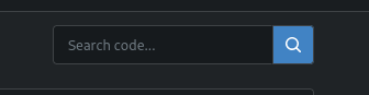
silverwind
5a8559ec47
Fix border on focus in dashboard repo search ( #29893 )
...
Before:
<img width="449" alt="Screenshot 2024-03-18 at 22 35 10"
src="https://github.com/go-gitea/gitea/assets/115237/f2893870-e7a3-4e34-b0cf-4610735c9b36 ">
After:
<img width="453" alt="image"
src="https://github.com/go-gitea/gitea/assets/115237/36a9f800-28a4-40fc-b6d2-a2e717ddba01 ">
2024-03-19 10:36:54 +00:00
silverwind
4e547822f3
Remove fomantic message module ( #29856 )
...
Remove this CSS-only module, which gives a nice reduction in CSS size.
Should look exactly like before.
2024-03-17 11:21:14 +08:00
silverwind
ffeaf2d0bd
add .suppressed link class ( #29847 )
...
Extract from https://github.com/go-gitea/gitea/pull/29344 . With this
class it's possible to have links that don't color on hover. It will be
useful for https://github.com/go-gitea/gitea/pull/29429 .
2024-03-16 17:58:58 +01:00
wxiaoguang
66902d89e5
Refactor markdown attention render ( #29833 )
...
* Remove some deadcode
* Use 2-word name for CSS class names
* Remove "gt-*" rules for sanitizer

The UI doesn't change much.
2024-03-16 11:34:38 +00:00
wxiaoguang
7a6260f889
Improve repo search UI ( #29767 )
...
1. Introduce a special "flex-items-block" for menu items, to align the
dropdown menu items
2. Simplify the "repo search" form
3. Add missing "TopicOnly" search option
Screenshots:
The old UI items don't align:
<details>

</details>
New UI (doesn't change much, but the items align)
<details>


</details>
---------
Co-authored-by: silverwind <me@silverwind.io>
2024-03-15 09:45:30 +00:00
silverwind
0827552d9a
Remove scrollbar customizations ( #29800 )
...
Fixes https://github.com/go-gitea/gitea/issues/29652 . Removes all
scrollbar customization as per popular vote on
https://github.com/go-gitea/gitea/issues/29652#issuecomment-1985846162 .
There is one more case of `-webkit-scrollbar` left in CSS and
https://github.com/go-gitea/gitea/pull/29400 will get rid of that as
well.
2024-03-15 04:45:45 +00:00
silverwind
256a1eeb9a
Add <overflow-menu>, rename webcomponents ( #29400 )
...
1. Add `<overflow-menu>` web component
2. Rename `<gitea-origin-url>` to `<origin-url>` and make filenames
match.
<img width="439" alt="image"
src="https://github.com/go-gitea/gitea/assets/115237/2fbe4ca4-110b-4ad2-8e17-c1e116ccbd74 ">
<img width="444" alt="Screenshot 2024-03-02 at 21 36 52"
src="https://github.com/go-gitea/gitea/assets/115237/aa8f786e-dc8c-4030-b12d-7cfb74bdfd6e ">
<img width="537" alt="Screenshot 2024-03-03 at 03 05 06"
src="https://github.com/go-gitea/gitea/assets/115237/fddd50aa-adf1-4b4b-bd7f-caf30c7b2245 ">

TODO:
- [x] Check if removal of `requestAnimationFrame` is possible to avoid
flash of content. Likely needs a `MutationObserver`.
- [x] Hide tippy when button is removed from DOM.
- [x] ~~Implement right-aligned items
(https://github.com/go-gitea/gitea/pull/28976 )~~. Not going to do it.
- [x] Clean up CSS so base element has no background and add background
via tailwind instead.
- [x] Use it for org and user page.
---------
Co-authored-by: Giteabot <teabot@gitea.io>
Co-authored-by: wxiaoguang <wxiaoguang@gmail.com>
2024-03-15 02:05:31 +00:00
Denys Konovalov
e0b002a4a8
Unify search boxes ( #29530 )
...
Unify all but a few search boxes to use uniform style, uniform
translations and shared templates where possible.
Remove a few duplicated search templates, e. g. code search.
<details><summary>Example after screenshots:</summary>


</details>
Also includes #29700
Co-authored-by: 6543 <6543@obermui.de>
---------
Co-authored-by: 6543 <m.huber@kithara.com>
Co-authored-by: 6543 <6543@obermui.de>
Co-authored-by: silverwind <me@silverwind.io>
Co-authored-by: Giteabot <teabot@gitea.io>
2024-03-14 23:24:59 +00:00
silverwind
9b69f76e5a
Completely style the webkit autofill ( #29683 )
...
Previously it was only partially styled, e.g. there was black text on
white background even in dark theme caused by fomantic styles.
<img width="195" alt="image"
src="https://github.com/go-gitea/gitea/assets/115237/bc5cf516-2aef-45c3-854a-c9f5497aacca ">
<img width="195" alt="Screenshot 2024-03-09 at 02 09 29"
src="https://github.com/go-gitea/gitea/assets/115237/ef0af17d-6e0b-402e-b24d-bfa34dc2f4e0 ">
Co-authored-by: Giteabot <teabot@gitea.io>
2024-03-09 12:14:42 +00:00
silverwind
114bb505a3
Style fomantic grey labels ( #29458 )
...
Fomantic grey labels in the dashboard repo lists were showing original
fomantic colors, fixed that. Also slightly tweaked the light theme
colors so it uses same opacity values as dark theme.
<img width="165" alt="Screenshot 2024-03-07 at 21 06 23"
src="https://github.com/go-gitea/gitea/assets/115237/72744d6f-2ee1-4e5d-8ba0-b482a446f535 ">
<img width="167" alt="Screenshot 2024-03-07 at 21 06 00"
src="https://github.com/go-gitea/gitea/assets/115237/1ba93775-e5a9-4b28-b90f-59c1e9199687 ">
2024-03-08 09:42:12 +00:00
silverwind
6e1873288f
Improve contrast on blame timestamp, fix double border ( #29482 )
...
Before, double border on top, bad contrast on dark:
<img width="155" alt="Screenshot 2024-02-29 at 02 06 17"
src="https://github.com/go-gitea/gitea/assets/115237/fc0f1e08-a5ce-47ed-9eb6-135eed5a1abb ">
<img width="126" alt="Screenshot 2024-02-29 at 02 07 28"
src="https://github.com/go-gitea/gitea/assets/115237/38ae8483-8d9b-484c-8909-d4466131ea16 ">
After, no double border on top, good contrast:
<img width="154" alt="Screenshot 2024-02-29 at 02 20 20"
src="https://github.com/go-gitea/gitea/assets/115237/ad91282b-e9f5-4f41-8f5e-6ba28db3beac ">
<img width="147" alt="Screenshot 2024-02-29 at 02 20 38"
src="https://github.com/go-gitea/gitea/assets/115237/7ee2ec92-e72a-4981-aec3-98fc8e579bae ">
2024-02-29 10:00:33 +08:00
silverwind
f4b92578b4
Add tailwindcss ( #29357 )
...
This will get tailwindcss working on a basic level. It provides only the
utility classes, e.g. no tailwind base which we don't need because we
have our own CSS reset. Without the base, we also do not have their CSS
variables so a small amount of features do not work and I removed the
generated classes for them.

***Note for future developers: This currently uses a `tw-` prefix, so we
use it like `tw-p-3`.***

<details>
<summary>Currently added CSS, all false-positives</summary>

```
.\!visible{

    visibility: visible !important
}

.visible{

    visibility: visible
}

.invisible{

    visibility: hidden
}

.collapse{

    visibility: collapse
}

.static{

    position: static
}

.\!fixed{

    position: fixed !important
}

.absolute{

    position: absolute
}

.relative{

    position: relative
}

.sticky{

    position: sticky
}

.left-10{

    left: 2.5rem
}

.isolate{

    isolation: isolate
}

.float-right{

    float: right
}

.float-left{

    float: left
}

.mr-2{

    margin-right: 0.5rem
}

.mr-3{

    margin-right: 0.75rem
}

.\!block{

    display: block !important
}

.block{

    display: block
}

.inline-block{

    display: inline-block
}

.inline{

    display: inline
}

.flex{

    display: flex
}

.inline-flex{

    display: inline-flex
}

.\!table{

    display: table !important
}

.inline-table{

    display: inline-table
}

.table-caption{

    display: table-caption
}

.table-cell{

    display: table-cell
}

.table-column{

    display: table-column
}

.table-column-group{

    display: table-column-group
}

.table-footer-group{

    display: table-footer-group
}

.table-header-group{

    display: table-header-group
}

.table-row-group{

    display: table-row-group
}

.table-row{

    display: table-row
}

.flow-root{

    display: flow-root
}

.inline-grid{

    display: inline-grid
}

.contents{

    display: contents
}

.list-item{

    display: list-item
}

.\!hidden{

    display: none !important
}

.hidden{

    display: none
}

.flex-shrink{

    flex-shrink: 1
}

.shrink{

    flex-shrink: 1
}

.flex-grow{

    flex-grow: 1
}

.grow{

    flex-grow: 1
}

.border-collapse{

    border-collapse: collapse
}

.select-all{

    user-select: all
}

.resize{

    resize: both
}

.flex-wrap{

    flex-wrap: wrap
}

.overflow-visible{

    overflow: visible
}

.rounded{

    border-radius: 0.25rem
}

.border{

    border-width: 1px
}

.text-justify{

    text-align: justify
}

.uppercase{

    text-transform: uppercase
}

.lowercase{

    text-transform: lowercase
}

.capitalize{

    text-transform: capitalize
}

.italic{

    font-style: italic
}

.text-red{

    color: var(--color-red)
}

.text-shadow{

    color: var(--color-shadow)
}

.underline{

    text-decoration-line: underline
}

.overline{

    text-decoration-line: overline
}

.line-through{

    text-decoration-line: line-through
}

.outline{

    outline-style: solid
}

.ease-in{

    transition-timing-function: cubic-bezier(0.4, 0, 1, 1)
}

.ease-in-out{

    transition-timing-function: cubic-bezier(0.4, 0, 0.2, 1)
}

.ease-out{

    transition-timing-function: cubic-bezier(0, 0, 0.2, 1)
}
```

</details>

---------

Co-authored-by: Giteabot <teabot@gitea.io>
2024-02-25 17:46:46 +01:00
silverwind
39f8ab591c
Clean up diff header css and reduce global textarea min-height ( #29232 )
...
1. Tweak diff header and remove a numbe of unneeded CSS for it:
Before:
<img width="433" alt="Screenshot 2024-02-18 at 01 08 09"
src="https://github.com/go-gitea/gitea/assets/115237/d8b377c0-57bc-44d5-bb57-a582c7d4b3b4 ">
After:
<img width="463" alt="Screenshot 2024-02-18 at 01 07 56"
src="https://github.com/go-gitea/gitea/assets/115237/d08c17e7-5b86-4d07-81da-6371f4754325 ">
3. Reduce height of review textarea and also reduce fomantic's CSS from
12em to 8em. Now fits better on my screen:
<img width="1352" alt="image"
src="https://github.com/go-gitea/gitea/assets/115237/5c658d13-295e-4929-94da-13ade888020d ">
---------
Co-authored-by: delvh <dev.lh@web.de>
2024-02-18 14:51:21 +00:00
Tim-Nicas Oelschläger
374e886f51
Change webhook-type in create-view ( #29114 )
...
It's now possible to change webhook-type in create-view.
before:
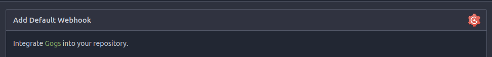
after:

---------
Co-authored-by: silverwind <me@silverwind.io>
Co-authored-by: Giteabot <teabot@gitea.io>
2024-02-15 14:59:48 +01:00
Yarden Shoham
12865ae9c6
Add alert blocks in markdown ( #29121 )
...
- Follows https://github.com/go-gitea/gitea/pull/21711
- Closes https://github.com/go-gitea/gitea/issues/28316
Implement GitHub's alert blocks markdown feature
Docs:
-
https://docs.github.com/en/get-started/writing-on-github/getting-started-with-writing-and-formatting-on-github/basic-writing-and-formatting-syntax#alerts
- https://github.com/orgs/community/discussions/16925
### Before
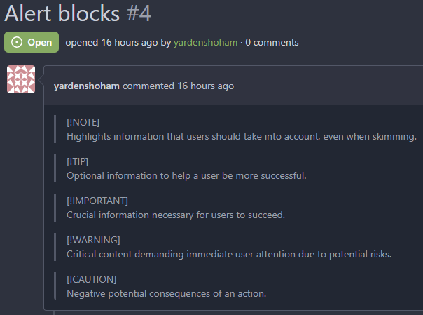
### After

## ⚠️ BREAKING ⚠️
The old syntax no longer works
How to migrate:
If you used
```md
> **Note** My note
```
Switch to
```md
> [!NOTE]
> My note
```
---------
Signed-off-by: Yarden Shoham <git@yardenshoham.com>
Co-authored-by: silverwind <me@silverwind.io>
Co-authored-by: Giteabot <teabot@gitea.io>
2024-02-10 18:43:09 +00:00
KN4CK3R
c3e462921e
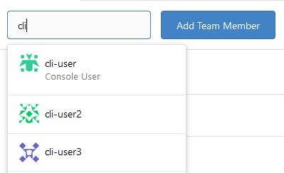
Improve user search display name ( #29002 )
...
I tripped over this strange method and I don't think we need that
workaround to fix the value.
old:
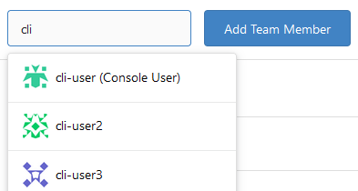
new:
---------
Co-authored-by: silverwind <me@silverwind.io>
Co-authored-by: wxiaoguang <wxiaoguang@gmail.com>
2024-02-01 17:10:16 +00:00
wxiaoguang
ad0b637d46
Fix button size in "attached header right" ( #28770 )
...
Before:
<details>

</details>
After:


2024-01-12 14:43:40 +00:00
Denys Konovalov
7d62615513
Revamp repo header ( #27760 )
...
Redesign repo header with following new aspects:
- responsive & better-looking repo title
- hide repo button text instead of icons in mobile view
- use same tab style as on explore and org page
<details>
<summary>Before:</summary>


</details>
<details>
<summary>After:</summary>


2024-01-12 03:44:06 +00:00
yp05327
f39256f035
Add word-break to organization name and description ( #26624 )
...
Fix #24318
Before:


After:


2023-10-25 10:40:39 +00:00
wxiaoguang
6c501b1498
Improve dropdown button alignment and fix hover bug ( #27632 )
...
1. fix #27631 , and add samples to devtest page
2. fix incorrect color for "ui dropdown button" when hover
2023-10-16 07:26:08 +00:00
silverwind
532f166c4d
Enable shorthands in declaration-strict-value linter ( #27597 )
...
Enable [shorthand
matching](https://github.com/AndyOGo/stylelint-declaration-strict-value#expandshorthand )
in this lint rule and match color properties by regex. Patterns like
this will now fail lint:
```css
background: #123456 ;
border: 1px sold rgba(0,0,0,0);
```
2023-10-13 08:19:21 +00:00
silverwind
023e937141
Rename the default themes to gitea-light, gitea-dark, gitea-auto ( #27419 )
...
Part of https://github.com/go-gitea/gitea/issues/27097 :
- `gitea` theme is renamed to `gitea-light`
- `arc-green` theme is renamed to `gitea-dark`
- `auto` theme is renamed to `gitea-auto`
I put both themes in separate CSS files, removing all colors from the
base CSS. Existing users will be migrated to the new theme names. The
dark theme recolor will follow in a separate PR.
## ⚠️ BREAKING ⚠️
1. If there are existing custom themes with the names `gitea-light` or
`gitea-dark`, rename them before this upgrade and update the `theme`
column in the `user` table for each affected user.
2. The theme in `<html>` has moved from `class="theme-name"` to
`data-theme="name"`, existing customizations that depend on should be
updated.
---------
Co-authored-by: Lunny Xiao <xiaolunwen@gmail.com>
Co-authored-by: Giteabot <teabot@gitea.io>
2023-10-06 09:46:36 +02:00
Denys Konovalov
33de64cb21
link to file from its history ( #27354 )
...
Fixes #3852
Fixes https://github.com/go-gitea/gitea/issues/26707

Add a button on file history which directs you to the file at the
selected commit.

Co-authored-by: silverwind <me@silverwind.io>
2023-10-02 04:04:32 +00:00
wxiaoguang
7ea2a910ce
Improve branch list UI ( #27319 )
...
1. Put the `"octicon-shield-lock"` into the flex container, then it
doesn't need a separate flex box
2. Remove some unnecessary `gt-df` helpers
3. Make `btn` button has the same flex behavior as `ui button`

2023-09-28 04:04:32 +00:00
silverwind
6af34c09a7
Use mask-based fade-out effect for .new-menu ( #27181 )
...
The `.new-menu` was using a pseudo-element based fade-out effect.
Replace this with a more modern mask-based effect which in this case
required a child element to avoid fading out the background as well, so
I applied it to child `new-menu-inner` which was present on all these
menus except explore where I added it.
There is no visual difference except that the items on the explore page
have no `gap` between them any longer, making it consistent with other
menus. Before and after:
<img width="221" alt="Screenshot 2023-09-21 at 21 13 19"
src="https://github.com/go-gitea/gitea/assets/115237/b4a38ce2-cee1-4c54-84a5-e1d0bfd79e29 ">
<img width="222" alt="Screenshot 2023-09-21 at 21 32 36"
src="https://github.com/go-gitea/gitea/assets/115237/bb6b1335-d935-4ad4-bb85-3b0fc3027c2b ">
Also, this cleans up the related CSS vars:
- `--color-header-wrapper-transparent` is removed, no longer needed
- `--color-header-wrapper` is defined in base theme as well, was
previously unset and therefor transparent.
[no whitespace
diff](https://github.com/go-gitea/gitea/pull/27181/files?diff=unified&w=1 )
[demo of mask fade](https://jsfiddle.net/silverwind/tsfadb3u/ )
2023-09-25 01:03:00 +00:00
wxiaoguang
c2cabe7b28
Fix repo sub menu ( #27169 )
...
Fix #27166
2023-09-21 21:16:14 +08:00
puni9869
a50d9af876
Display archived labels specially when listing labels ( #26820 )
...
Follow up https://github.com/go-gitea/gitea/pull/26741

Changes:
Added archived label for org labels and added into issue filter list.


Part of https://github.com/go-gitea/gitea/issues/25237

---------

Signed-off-by: puni9869 <punitinani1@hotmail.com>
Co-authored-by: silverwind <me@silverwind.io>
2023-09-18 04:54:05 +00:00
Kerwin Bryant
a38eca3f52
Fix Fomantic's line-height causing vertical scrollbars to appear ( #26961 )
...
Before:

After:

---
1. **Remove the scroll bar exception that in the a tag**
2. **Reduce the actual width of the a tag to the actual width of the
content**
As shown in the screenshot, the red box area should not be clickable
2023-09-13 09:08:45 +00:00
wxiaoguang
1221221595
Add "dir=auto" for input/textarea elements by default ( #26735 )
...
Co-authored-by: silverwind <me@silverwind.io>
Co-authored-by: Giteabot <teabot@gitea.io>
2023-09-07 08:00:20 +00:00
Kerwin Bryant
113eb5fc24
Fix UI anomalies ( #26929 )
2023-09-06 07:00:45 +00:00
wxiaoguang
51cfe0e7de
Remove CSS has selector and improve various styles ( #26891 )
...
Replace #26850
Major changes:
1. Remove all `has` selectors, it is still not supported by firefox.
Actually there could be some more general and clearer approaches
2. Remove `two-toggle-buttons`, the `.ui.buttons` just works well
3. Rewrite the `.ui.buttons` border styles, see the screenshots
4. Remove the "fine-tuning" paddings from the the flex children, they
could layout themselves well.


2023-09-04 18:22:46 +08:00
wxiaoguang
fba7150ca9
Refactor "shortsha" ( #26877 )
...
The old code used complex `if` blocks and strange HTML layouts.
<details>

</details>
This PR refactors the template code and remove legacy CSS styles. The UI
doesn't change much.

2023-09-03 02:58:52 +00:00
6543
79f7329971
Make it posible to customize nav text color via css var ( #26807 )
...
---
*Sponsored by Kithara Software GmbH*
2023-09-02 05:10:41 +02:00
wxiaoguang
fcb4941d47
Remove some unused CSS styles ( #26852 )
...
1. `icons`: globally searched, no use in templates.
2. toast's `display: inline-block;`: there is a `display: flex` below.
2023-09-01 08:59:38 +02:00
wxiaoguang
d5703d4a1b
Remove "TODO" tasks from CSS file ( #26835 )
...
1. Use `gt-invisible` instead of `invisible`.
2. Use `gt-word-break` instead of `dont-break-out` (there is a slight
different "hyphens", but I think it won't affect too much since it is
only used for the "full name").
3. Remove `.small.button:has(svg)` , now our buttons could layout SVG
correctly, and actually I didn't see this CSS class is used in code.
2023-08-31 10:49:53 +00:00
silverwind
3d109861dd
Render code blocks in repo description ( #26830 )
...
Backtick syntax now works in repo description too. Also, I replaced the
CSS for this was a new single class, making it more flexible and not
dependent on a parent. Also, very slightly reduced font size from 16.8px
to 16px.

---------

Co-authored-by: wxiaoguang <wxiaoguang@gmail.com>
2023-08-31 05:01:01 +00:00
wxiaoguang
19a1e1b20e
Remove polluted .ui.right ( #26825 )
...
Each change is tested manually line by line. There are too many changes
so I can't share dozens of screenshots.

In short:

1. `ui right` could be still used in `ui top attached header`, because
there is a special case.
2. A lot of `ui right` are just no-op, so they can be removed safely.
3. Some of the `ui right` should be replaced by `gt-float-right` (to
avoid breaking, leave them to the future).
4. A few of the `ui right` could be rewritten by flex.
2023-08-31 02:29:59 +00:00
wxiaoguang
1bb9b1c4d9
Remove polluted ".ui.left" style ( #26809 )
2023-08-30 21:46:24 +08:00
delvh
2590707122
Remove fomantic text module ( #26777 )
...
Corollary to #26775 :
All selectors I found that are actually used and not necessarily present
in the current code have been copied to `web_src/css/base.css`.
Everything else should be a clean removal.
2023-08-30 10:37:17 +00:00
wxiaoguang
96ba747ff2
Fix notification circle (border-radius) ( #26794 )
...
`border-radius` means `radius`, not `diameter`, so it should be `50%` and `boxHeight / 2`
2023-08-29 14:03:34 +00:00
delvh
dca2f9371d
Unify border-radius behavior ( #26770 )
...
## Changes
- no more hardcoded `border-radius`es (apart from `0`)
- no more value inconsistencies
- no more guessing what pixel value you should use
- two new variables:
- `--border-radius-medium` (for elements where the normal border radius
does not suffice)
  - `--border-radius-circle` (for displaying circles)

---------

Co-authored-by: silverwind <me@silverwind.io>
2023-08-28 19:43:59 +00:00
wxiaoguang
4803766f7a
Refactor some CSS styles and simplify code ( #26771 )
...
Refactor some CSS styles and simplify code.

Some styles are not in use, remove them.
2023-08-28 22:14:51 +08:00
wxiaoguang
8f2e2878e5
Use line-height: normal by default ( #26635 )
...
Fix #26537 again because 1.15 is too small for some fonts.
2023-08-22 10:19:15 +00:00
wxiaoguang
7934602a4c
Improve some flex layouts ( #26649 )
...
Fix #26617

1. Separate the "flex-list" examples into a dedicated template, and add some more examples
2. Use `flex-basis` instead of `flex-shrink` for `flex-item-trailing`, to avoid wrapping the texts too aggressively
3. Some `flex-wrap: wrap;` are removed
2023-08-22 12:57:02 +08:00
silverwind
facdaee47b
Replace box-shadow for floating dropdown as well ( #26581 )
...
Add `box-shadow` replacement to the `floating` dropdown variant as well,
which was missed in https://github.com/go-gitea/gitea/pull/26469 . The
Fomantic style has `!important`, so this has to have too. Also made a
tiny adjustment to shadow color on dark theme.
<img width="305" alt="Screenshot 2023-08-18 at 16 40 34"
src="https://github.com/go-gitea/gitea/assets/115237/a0aac9cb-6393-4d69-b0b3-00eaac5ccf9f ">
<img width="202" alt="Screenshot 2023-08-18 at 16 40 22"
src="https://github.com/go-gitea/gitea/assets/115237/0a5fa3aa-7452-4dbd-86ed-ccbc1c872ebb ">
Co-authored-by: Giteabot <teabot@gitea.io>
2023-08-21 12:49:49 +02:00
wxiaoguang
fe2b9274b1
Fix various line-height styles ( #26553 )
...
Fix #26537
Use the same default line-height as "normalize.css" instead of "1". "1"
is not right because it doesn't work with descent part and causes
overflow problems.

---------
Co-authored-by: silverwind <me@silverwind.io>
2023-08-17 21:50:32 +00:00
silverwind
376c0e25f7
Remove fomantic transition module ( #26469 )
...
Removes all dropdown and dimmer animations. Works everywhere as far as I
can tell, but need to give this thorough testing. Removes around 70kb
JS/CSS.

Note, I'm not 100% sure regarding the various callbacks, those will need
more investigation, but it appears to work nonetheless.

Fixes: https://github.com/go-gitea/gitea/issues/15709
2023-08-16 22:12:40 +00:00
silverwind
27e4ac3e40
Use hidden over clip for text truncation ( #26520 )
...
Avoid browser bugs:

- Firefox not cutting off -
https://github.com/go-gitea/gitea/pull/26354#issuecomment-1678456052
- Safari not showing ellipsis -
https://github.com/go-gitea/gitea/pull/26354#issuecomment-1678812801
2023-08-15 13:23:51 +00:00
a1012112796
19872063a3
add disable workflow feature ( #26413 )
...
As title, that's simmilar with github.


---------
Signed-off-by: a1012112796 <1012112796@qq.com>
Co-authored-by: silverwind <me@silverwind.io>
Co-authored-by: Jason Song <i@wolfogre.com>
2023-08-14 15:14:30 +00:00
Maxim Slipenko
c2b6897e35
Fix text truncate ( #26354 )
...
Fixes: https://github.com/go-gitea/gitea/issues/25597
Before:

After:
Co-authored-by: Giteabot <teabot@gitea.io>
2023-08-07 22:44:04 +02:00
sebastian-sauer
55532061c8
Add commits dropdown in PR files view and allow commit by commit review ( #25528 )
...
This PR adds a new dropdown to select a commit or a commit range
(shift-click like github) of a Pull Request.
After selection of a commit only the changes of this commit will be shown.
When selecting a range of commits the diff of this range is shown.
This allows to review a PR commit by commit or by viewing only commit ranges.
The "Show changes since your last review" mechanism github uses is implemented, too.
When reviewing a single commit or a commit range the "Viewed" functionality is disabled.
## Screenshots
### The commit dropdown

### Selecting a commit range

### Show changes of a single commit only

### Show changes of a commit range

Fixes https://github.com/go-gitea/gitea/issues/20989
Fixes https://github.com/go-gitea/gitea/issues/19263
---------
Co-authored-by: silverwind <me@silverwind.io>
Co-authored-by: KN4CK3R <admin@oldschoolhack.me>
Co-authored-by: wxiaoguang <wxiaoguang@gmail.com>
Co-authored-by: delvh <dev.lh@web.de>
2023-07-28 21:18:12 +02:00
silverwind
e62ea96ada
Increase table cell horizontal padding ( #26140 )
...
Extract from https://github.com/go-gitea/gitea/pull/26043 , just the
padding increase.
Before and After (hard to notice, but it's there):
<img width="427" alt="Screenshot 2023-07-25 at 19 37 12"
src="https://github.com/go-gitea/gitea/assets/115237/9543dcda-eccb-4739-b7dd-06b076108ab4 ">
<img width="420" alt="Screenshot 2023-07-25 at 19 37 26"
src="https://github.com/go-gitea/gitea/assets/115237/0a9c3724-81a1-4c67-a13b-4b728a51fc3a ">
Co-authored-by: Giteabot <teabot@gitea.io>
2023-07-25 23:54:20 +02:00
silverwind
0006169f38
Actions list enhancements ( #25601 )
...
Various small enhancements to the actions list. Before and after:
<img width="1264" alt="Screenshot 2023-06-30 at 00 11 40"
src="https://github.com/go-gitea/gitea/assets/115237/bb4162ee-cdcf-4a73-b05e-f9521562edbb ">
<img width="1264" alt="Screenshot 2023-06-30 at 00 09 51"
src="https://github.com/go-gitea/gitea/assets/115237/52a70ea9-4bb3-406e-904b-0fdaafde9582 ">
---------
Co-authored-by: Giteabot <teabot@gitea.io>
2023-07-04 09:59:47 +00:00
silverwind
1195d66c15
Prevent SVG shrinking ( #25652 )
...
This will prevent the most common cases of SVG shrinking because lack of
space. I evaluated multiple options and this seems to be the one with
the least impact in size and processing cost, so I went with it.
Unfortunately, CSS can not dynamically convert `16` obtained from
`attr()` to `16px`, or else a generic solution for all sizes would have
been possible. But a solution is [in
sight](https://developer.mozilla.org/en-US/docs/Web/CSS/attr#type-or-unit )
with `attr(width px)` but no browser supports it currently.
2023-07-04 02:15:06 +00:00
silverwind
64f2d70262
Replace fomantic divider module with our own ( #25539 )
...
Should look exactly like before for normal dividers. "Horizontal" ones
look better because they no longer use image backgrounds.
<img width="917" alt="Screenshot 2023-06-27 at 19 07 56"
src="https://github.com/go-gitea/gitea/assets/115237/d97d8dec-6859-44a8-85ba-e4549b4dd9df ">
<img width="914" alt="Screenshot 2023-06-27 at 19 05 58"
src="https://github.com/go-gitea/gitea/assets/115237/8bf98544-2d82-4ebf-ac68-d6dc237bd6b2 ">
<img width="1246" alt="Screenshot 2023-06-27 at 19 00 42"
src="https://github.com/go-gitea/gitea/assets/115237/36a6bb21-6029-4f53-8bee-535f55c66fed ">
<img width="344" alt="Screenshot 2023-06-27 at 18 58 15"
src="https://github.com/go-gitea/gitea/assets/115237/a9e70aee-8e6b-4ea1-9e93-19c9f96aec6e ">
<img width="823" alt="Screenshot 2023-06-27 at 18 56 22"
src="https://github.com/go-gitea/gitea/assets/115237/e7a497cd-f262-4683-8872-23c3c8cce32f ">
<img width="330" alt="Screenshot 2023-06-27 at 19 21 11"
src="https://github.com/go-gitea/gitea/assets/115237/42f24149-a655-4c7e-bd26-8ab52db6446b ">
2023-06-29 20:24:22 +08:00
silverwind
c76b221cca
Reduce table padding globally ( #25568 )
...
Fomantic's tables have too much padding. Reduce it so we have more
information density in them. Especially the admin tables need this
because they are bursting already because of column count.
## Admin repolist before and after
<img width="909" alt="Screenshot 2023-06-28 at 20 27 55"
src="https://github.com/go-gitea/gitea/assets/115237/954c925c-8db5-47ce-ae51-a2168b857014 ">
<img width="897" alt="Screenshot 2023-06-28 at 20 36 03"
src="https://github.com/go-gitea/gitea/assets/115237/0bddc09a-9117-48b3-a17e-3d34c58d8d3d ">
## Other tables
<img width="1230" alt="Screenshot 2023-06-28 at 20 36 22"
src="https://github.com/go-gitea/gitea/assets/115237/38f555b6-a7ce-416a-9f1f-706eaf18863b ">
<img width="1236" alt="Screenshot 2023-06-28 at 20 26 37"
src="https://github.com/go-gitea/gitea/assets/115237/82b2878e-358c-4dc2-a6b4-c66e43cd2dfb ">
<img width="1231" alt="Screenshot 2023-06-28 at 20 59 30"
src="https://github.com/go-gitea/gitea/assets/115237/c6a92e55-a3a3-4c80-9a0d-50aebb49886c ">
Files table is unaffected because it has custom padding already.
---------
Co-authored-by: Giteabot <teabot@gitea.io>
2023-06-29 04:40:03 +00:00
silverwind
fdab4e3d84
Add custom ansi colors and CSS variables for them ( #25546 )
...
Use our existing color palette to map to the 16 basic ansi colors. This
is backwards-compatible because it aliases the existing color names.
Side note: I think the colors in `console.css` for console file
rendering are incomplete, but fixing those is out of scope here imo.
Before and after:
<img width="542" alt="Screenshot 2023-06-28 at 00 26 12"
src="https://github.com/go-gitea/gitea/assets/115237/86d41884-bc47-4e85-8aec-621eb7320f0b ">
<img width="546" alt="Screenshot 2023-06-28 at 00 28 24"
src="https://github.com/go-gitea/gitea/assets/115237/39fa3b37-d49e-49b1-b6bc-390ac8ca24b2 ">
---------
Co-authored-by: Giteabot <teabot@gitea.io>
2023-06-28 15:38:55 +02:00
silverwind
b943318617
Update JS dependencies and misc tweaks ( #25540 )
...
- Update all JS dependencies
- Enable `declaration-property-unit-disallowed-list` to forbid `em` on
`line-height`
- Rename dependency update targets to `update-js` and `update-py` and
document them
- Remove margin on Asciicast viewer
- Tested Swagger, Katex, Asciicast
<img width="1243" alt="Screenshot 2023-06-27 at 19 51 05"
src="https://github.com/go-gitea/gitea/assets/115237/2d2722a0-2aa7-4f4c-b8bd-17e1f3637b78 ">
2023-06-27 21:44:17 +02:00
hiifong
1069472c0c
Fix input line-height cutting off g ( #25334 )
...
Fix the incomplete display of input text
Before:


After:

---------
Co-authored-by: silverwind <me@silverwind.io>
Co-authored-by: Giteabot <teabot@gitea.io>
2023-06-27 08:45:43 +00:00
wxiaoguang
323c6cba20
Fine tune "dropdown button" icon ( #25442 )
...

----

2023-06-25 02:40:41 +00:00
silverwind
656d3cc719
Various UI fixes ( #25264 )
...
Numerous small UI fixes:

- Fix double border in collaborator list
- Fix system notice table background
- Mute links in repo and org lists
- Downsize projects edit buttons
- Improve milestones and project list rendering
- Condense milestone list entry to a single line of "metas"
- Mute ".." button in repo files list
2023-06-21 21:59:49 -04:00
HesterG
dfd19fa38c
Fine tune project board label colors and modal content background ( #25419 )
...
- The label text color on project board is not contrasting enough,
changed to colors that are same as places that also used
`useLightTextOnBackground` function
([util_render.go](2cdf260f42/modules/templates/util_render.go (L136-L141)2cdf260f42/web_src/js/components/ContextPopup.vue (L81-L84)https://github.com/go-gitea/gitea/assets/17645053/1527ca28-c884-4ca9-a4be-7a72ad1a093a ">
<img width="900" alt="Screen Shot 2023-06-21 at 14 25 52"
src="https://github.com/go-gitea/gitea/assets/17645053/fab82116-7376-4027-a0a4-9eedf9fb0a30 ">
After:
<img width="1383" alt="Screen Shot 2023-06-21 at 14 19 33"
src="https://github.com/go-gitea/gitea/assets/17645053/fe0997e7-fee6-4522-bc4e-545088ec1cc8 ">
<img width="797" alt="Screen Shot 2023-06-21 at 14 32 42"
src="https://github.com/go-gitea/gitea/assets/17645053/b0591af0-950c-4448-9430-34d6c7215971 ">
2023-06-21 18:15:51 +08:00
silverwind
e50c3e8431
Navbar styling rework ( #25343 )
...
- Extract navbar CSS to own file
- Reduce height from 52px to 50px
- Give every item a hover effect of of 36px, including the logo and on
mobile
- Consistent horizontal padding of 10px left and right
<img width="549" alt="Screenshot 2023-06-18 at 13 41 16"
src="https://github.com/go-gitea/gitea/assets/115237/0b00d101-253e-4b1f-9ee2-322d60fb2e26 ">
<img width="98" alt="Screenshot 2023-06-18 at 14 03 43"
src="https://github.com/go-gitea/gitea/assets/115237/4ef5d98b-4d1e-45de-822e-c2c844e19876 ">
<img width="234" alt="Screenshot 2023-06-18 at 14 03 18"
src="https://github.com/go-gitea/gitea/assets/115237/a4d9b04b-83de-42aa-a9ce-f010a9690688 ">
<img width="873" alt="Screenshot 2023-06-18 at 13 58 28"
src="https://github.com/go-gitea/gitea/assets/115237/8cb8e31e-2adf-40c8-ae3f-d00d011b4d1b ">
---------
Co-authored-by: wxiaoguang <wxiaoguang@gmail.com>
Co-authored-by: Giteabot <teabot@gitea.io>
2023-06-20 20:35:25 +00:00
silverwind
3ee8970419
add stylelint-stylistic ( #25285 )
...
Add
[stylelint-stylistic](https://github.com/elirasza/stylelint-stylistic ),
autofix all issues with two manual tweaks. This restores all the
stylistic rules removed in Stylelint 15.
2023-06-17 13:20:32 +00:00
wxiaoguang
6db66d8ca4
Fix some UI alignments ( #25277 )
...
Fixes: https://github.com/go-gitea/gitea/issues/25282

Fix the problems:

1. The `repo-button-row` had various patches before, this PR makes it
consistent
2. The "Add File" has wrong CSS class "icon", remove it
3. The "Add File" padding was overridden by "!important", fix it by
`.repo-button-row .button.dropdown` with comment
4. The selector `.ui.segments ~ .ui.top.attached.header` is incorrect,
it should use `+`
2023-06-15 15:12:08 +00:00
wxiaoguang
46c17c8029
Use flex to align SVG and text ( #25163 )
...
The code can be as simple as:
```html
<div class="flex-text-block">{{svg "octicon-alert"}} {{svg "octicon-x"}} text (block)</div>
<div><div class="flex-text-inline">{{svg "octicon-alert"}} {{svg "octicon-x"}} text</div> (inline)</div>
<div><button class="ui red button">{{svg "octicon-alert" 24}} {{svg "octicon-x" 24}} text</button></div>
```

---------
Co-authored-by: Giteabot <teabot@gitea.io>
2023-06-14 16:40:15 +00:00
wxiaoguang
4f3253feb9
Revert overflow: overlay (revert #21850 ) ( #25231 )
...
It causes not only one issue like #25221 (the footer width was also
affected by that change and was fixed some time ago)
The problem of "overflow: overlay" (#21850 ) is:
* It's not widely supported and is non-standard
https://caniuse.com/css-overflow-overlay
* It's not widely tested in Gitea (some standard layout like `ui
container + ui grid` may break it).
* The benefit seems smaller than the problems it brings.
So, I think it is good to revert it.
----
Let's leave enough time for testing and reviewing.
---------
Co-authored-by: Giteabot <teabot@gitea.io>
Co-authored-by: silverwind <me@silverwind.io>
2023-06-13 21:17:14 +02:00
wxiaoguang
d8e45608d6
Remove hacky patch for "safari emoji glitch fix" ( #25208 )
...
According to my test, the UI (emoji) is fine in Safari

And actually the code is just dead code, because the "resize" event is
never fired on page loading. So for most cases users just view the pages
without this hacky patch, nobody ever complains.
2023-06-12 15:44:53 +00:00
silverwind
96f9c11821
Minor arc-green color tweaks ( #25175 )
...
Some minor color tweaks
<img width="1271" alt="Screenshot 2023-06-09 at 13 29 25"
src="https://github.com/go-gitea/gitea/assets/115237/b7b34995-5d34-461f-8d19-4f5755a98109 ">
<img width="1272" alt="Screenshot 2023-06-09 at 13 31 20"
src="https://github.com/go-gitea/gitea/assets/115237/63c866b4-797e-46ed-ba28-b1162ccd3e15 ">
<img width="1276" alt="Screenshot 2023-06-09 at 13 32 21"
src="https://github.com/go-gitea/gitea/assets/115237/de7ee02e-d0c7-4979-a8aa-0fd03e8db491 ">
Co-authored-by: Giteabot <teabot@gitea.io>
2023-06-09 15:17:30 +00:00
silverwind
6a075589bf
Fix mobile navbar and misc cleanups ( #25134 )
...
- Fix and improve mobile navbar layout
- Apply all cleanups suggested in
https://github.com/go-gitea/gitea/pull/25111
- Make media query breakpoints match Fomantic's exactly
- Clean up whitespace in class on navbar items
Mobile navbar before and after:
<img width="745" alt="Screenshot 2023-06-08 at 08 40 56"
src="https://github.com/go-gitea/gitea/assets/115237/ca84b239-b10f-41db-8c06-dcf2b6dd9d28 ">
<img width="739" alt="Screenshot 2023-06-08 at 08 41 23"
src="https://github.com/go-gitea/gitea/assets/115237/09133c54-eb7e-4110-858c-ead23c3b7521 ">
---------
Co-authored-by: wxiaoguang <wxiaoguang@gmail.com>
Co-authored-by: Giteabot <teabot@gitea.io>
2023-06-09 09:10:51 +00:00
silverwind
623b3b590e
Button and color enhancements ( #24989 )
...
- Various corrections to button styles, especially secondary
- Remove focus highlight, it's annoying when it stays on button after
press
- Clearly define ghost and link buttons with demos in devtest
- Remove black, grey and tertiary buttons, they should not be used
- Make `arc-green` slightly darker
<img width="1226" alt="image"
src="https://github.com/go-gitea/gitea/assets/115237/8d89786a-01ab-40f8-ae5a-e17f40e35084 ">
<img width="1249" alt="image"
src="https://github.com/go-gitea/gitea/assets/115237/83651e6d-3c27-46ff-b8bd-ff344d70e949 ">
---------
Co-authored-by: wxiaoguang <wxiaoguang@gmail.com>
Co-authored-by: Giteabot <teabot@gitea.io>
2023-06-09 08:37:47 +00:00
HesterG
63a429581c
Modify OAuth login ui and fix display name, iconurl related logic ( #25030 )
...
Close #24808
Co-Authour @wxiaoguang @silverwind
1. Most svgs are found from https://worldvectorlogo.com/ , and some are
from conversion of png to svg. (facebook and nextcloud). And also
changed `templates/user/settings/security/accountlinks.tmpl`.
2. Fixed display name and iconurl related logic
# After
<img width="1436" alt="Screen Shot 2023-06-05 at 14 09 05"
src="https://github.com/go-gitea/gitea/assets/17645053/a5db39d8-1ab0-4676-82a4-fba60a1d1f84 ">
On mobile
<img width="378" alt="Screen Shot 2023-06-05 at 14 09 46"
src="https://github.com/go-gitea/gitea/assets/17645053/71d0f51b-baac-4f48-8ca2-ae0e013bd62e ">
user/settings/security/accountlinks (The dropdown might be improved
later)
<img width="973" alt="Screen Shot 2023-06-01 at 10 01 44"
src="https://github.com/go-gitea/gitea/assets/17645053/27010e7e-2785-4fc5-8c49-b06621898f37 ">
---------
Co-authored-by: silverwind <me@silverwind.io>
Co-authored-by: wxiaoguang <wxiaoguang@gmail.com>
2023-06-08 16:35:29 +00:00
silverwind
b6bcb79987
Improve notification icon and navbar ( #25111 )
...
Improvements to the notification icon and `<nav>`:
- Add a opaque color for header hover and use it, allowing the border to
be the right color on hover (sadly, not otherwise possible with CSS, not
even `color-mix`).
- Increase font size by 1px
- Use flexbox for slightly better text centering
- Reduce padding of user and add repo button, add margin on right side
of user menu
- Remove the `following bar` wrapper on navbar
<img width="176" alt="Screenshot 2023-06-07 at 00 07 08"
src="https://github.com/go-gitea/gitea/assets/115237/23cdc3d6-7f63-49df-bec3-f2e75e32a304 ">
<img width="63" alt="Screenshot 2023-06-07 at 00 07 14"
src="https://github.com/go-gitea/gitea/assets/115237/fae602c2-4467-4d50-b1ec-56317843f9a2 ">
<img width="84" alt="Screenshot 2023-06-07 at 00 07 36"
src="https://github.com/go-gitea/gitea/assets/115237/c48141b8-0b3c-48cc-846a-3a272524dbdb ">
<img width="329" alt="Screenshot 2023-06-07 at 00 25 10"
src="https://github.com/go-gitea/gitea/assets/115237/cda612f1-426e-466b-a351-fc992bfd18fd ">
<img width="186" alt="Screenshot 2023-06-07 at 00 35 45"
src="https://github.com/go-gitea/gitea/assets/115237/04484a2e-9bbf-493c-aa26-8e936da008fa ">
<img width="797" alt="Screenshot 2023-06-07 at 16 57 40"
src="https://github.com/go-gitea/gitea/assets/115237/e7ccb672-5807-4cb6-b306-b18ae0c7e321 ">
2023-06-07 22:21:57 +00:00
HesterG
58536093b3
Add details summary for vertical menus in settings to allow toggling ( #25098 )
...
Close #25051
[referenced
answer](https://stackoverflow.com/questions/10813581/can-i-replace-the-expand-icon-of-the-details-element/69722686#69722686 )
for marker overwrite. One limitation is that fomantic does not have
hover and active effects for the vertical submenu
([reference](https://fomantic-ui.com/collections/menu.html#sub-menu )).
And we might need to overwrite some styles if hover and active effects
are needed.
Update:
Used `data:image/svg` instead of `marker` content. And adjusted styles
for hover effect.
Take admin settings as an example:
https://github.com/go-gitea/gitea/assets/17645053/63f69823-ef43-47d5-a518-544b5ea35ba6
---------
Co-authored-by: silverwind <me@silverwind.io>
2023-06-07 10:49:48 +08:00
zeripath
036fb7861f
Clean up WebAuthn javascript code and remove JQuery code ( #22697 )
...
There were several issues with the WebAuthn registration and testing
code and the style
was very old javascript with jquery callbacks.

This PR uses async and fetch to replace the JQuery code.

Ref #22651

Signed-off-by: Andrew Thornton <art27@cantab.net>

---------

Signed-off-by: Andrew Thornton <art27@cantab.net>
Co-authored-by: delvh <dev.lh@web.de>
Co-authored-by: silverwind <me@silverwind.io>
2023-06-06 13:29:37 +08:00
wxiaoguang
e3897148f9
Minor UI improvements: logo alignment, auth map editor, auth name display ( #25043 )
...
Some minor UI improvements together (then no need to review 3 small PRs)
# The Map for auth sources
Close #24826
Now the LDAP and OAuth2 both have multiple line editor for the map (and
it can be resized by the handler)
<details>

</details>
# The account link display
Before, the UI is misaligned
This PR fixes the misalignment, remove "float right", and show the auth
source name and auth type (in the tooltip).
And the "active" color is changed from dark red to primary color.
Before:
<details>

</details>
After:
<details>
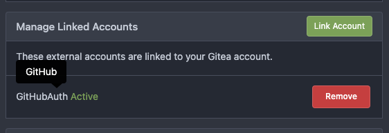
</details>
# The UI logo alignment
Changed file: `css/base.css`.
Before, there were some "fine tunes", these "fine tunes" only causes
misalignment.
<details>

</details>
After this PR:
<details>


</details>
2023-06-02 18:02:20 +08:00
silverwind
c5ede35124
Add button on diff header to copy file name, misc diff header tweaks ( #24986 )
...
1. Add this button:
<img width="232" alt="Screenshot 2023-05-29 at 15 21 47"
src="https://github.com/go-gitea/gitea/assets/115237/5eaf6bd1-83db-4ffc-9503-eda0c59807d2 ">
<img width="297" alt="Screenshot 2023-05-29 at 15 20 22"
src="https://github.com/go-gitea/gitea/assets/115237/708a344f-f6d7-4229-bfda-76e1571b42c8 ">
2. Correct `button-link` styles to not have a background hover effect.
3. Tweak `.ui.container` padding to be the same for fluid and non-fluid.
4. Misc enhancements to diff header:
Before:
<img width="984" alt="Screenshot 2023-05-29 at 15 38 53"
src="https://github.com/go-gitea/gitea/assets/115237/c7926f6a-bd0a-4b05-97ad-c91fc25c62d5 ">
After:
<img width="987" alt="Screenshot 2023-05-29 at 15 43 10"
src="https://github.com/go-gitea/gitea/assets/115237/0149f545-45f8-42cf-b443-e1c76bd5cdeb ">
2023-06-01 10:47:28 +00:00
Denys Konovalov
0c79a655d4
various style fixes ( #25008 )
...
- fixing various style issues (border color/radius, margin)
- added indent at some radio input blocks
---
### Before:


### After:


---------
Co-authored-by: silverwind <me@silverwind.io>
2023-05-30 22:28:25 +00:00
HesterG
1ea5c8b0ff
Add show timestamp/seconds and fullscreen options to action page ( #24876 )
...
Part of #24728
- The timestamp shows local time and is parsed by `date.toLocaleString`;
- "show seconds" and "show timestamps" are mutually exclusive, and they
can be both hidden.
https://github.com/go-gitea/gitea/assets/17645053/89531e54-37b7-4400-a6a0-bb3cc69eb6f5
Update for timestamp format:
<img width="306" alt="Screen Shot 2023-05-25 at 09 07 47"
src="https://github.com/go-gitea/gitea/assets/17645053/2d99768d-d39c-4c9e-81a2-7bc7470399dd ">
---------
Co-authored-by: silverwind <me@silverwind.io>
Co-authored-by: wxiaoguang <wxiaoguang@gmail.com>
2023-05-30 20:38:55 +00:00
silverwind
79a4c80f8d
Rework button coloring, add focus and active colors ( #24507 )
...
We were missing overrides for `:focus` and `:active` styles which I've
added here along with two new color variants `dark-1` and `dark-2` for
them. Fomantic UI has 4 different colors but I think 3 are sufficient. I
also changed it on arc-green so button goes darker when pressed.
<img width="129" alt="Screenshot 2023-05-04 at 01 21 43"
src="https://user-images.githubusercontent.com/115237/236072060-7389276a-275b-4d3e-aa52-20b37c6e6d92.png ">
<img width="130" alt="Screenshot 2023-05-04 at 01 17 59"
src="https://user-images.githubusercontent.com/115237/236071818-0e46414a-33db-4bb2-a3bd-35b514a8a2d0.png ">
<img width="129" alt="Screenshot 2023-05-04 at 01 18 07"
src="https://user-images.githubusercontent.com/115237/236071819-562b1e38-541f-432b-b3b6-48e6d7594d00.png ">
<img width="131" alt="Screenshot 2023-05-04 at 01 18 13"
src="https://user-images.githubusercontent.com/115237/236071820-89b7dba9-ce6c-48e5-a075-9053063e6ad3.png ">
<img width="133" alt="Screenshot 2023-05-04 at 01 18 30"
src="https://user-images.githubusercontent.com/115237/236071823-b6fe2df4-b3f0-4dc8-97a8-f90ba6d19bec.png ">
<img width="133" alt="Screenshot 2023-05-04 at 01 18 40"
src="https://user-images.githubusercontent.com/115237/236071824-b02ce61a-2367-4c29-8a25-45f231f5e5ee.png ">
One misc change includes some fixes to editor and slightly darker
selection.
<img width="1245" alt="Screenshot 2023-05-28 at 19 16 19"
src="https://github.com/go-gitea/gitea/assets/115237/1ea4a4b6-26ba-45af-9cbc-5b8c476c2338 ">
2023-05-29 12:45:22 +00:00